Running can be difficult. Social media is saturated with generic advice and if the content doesn’t speak to you directly it can easily lead to you feeling lost and unmotivated.
THE SOLUTION
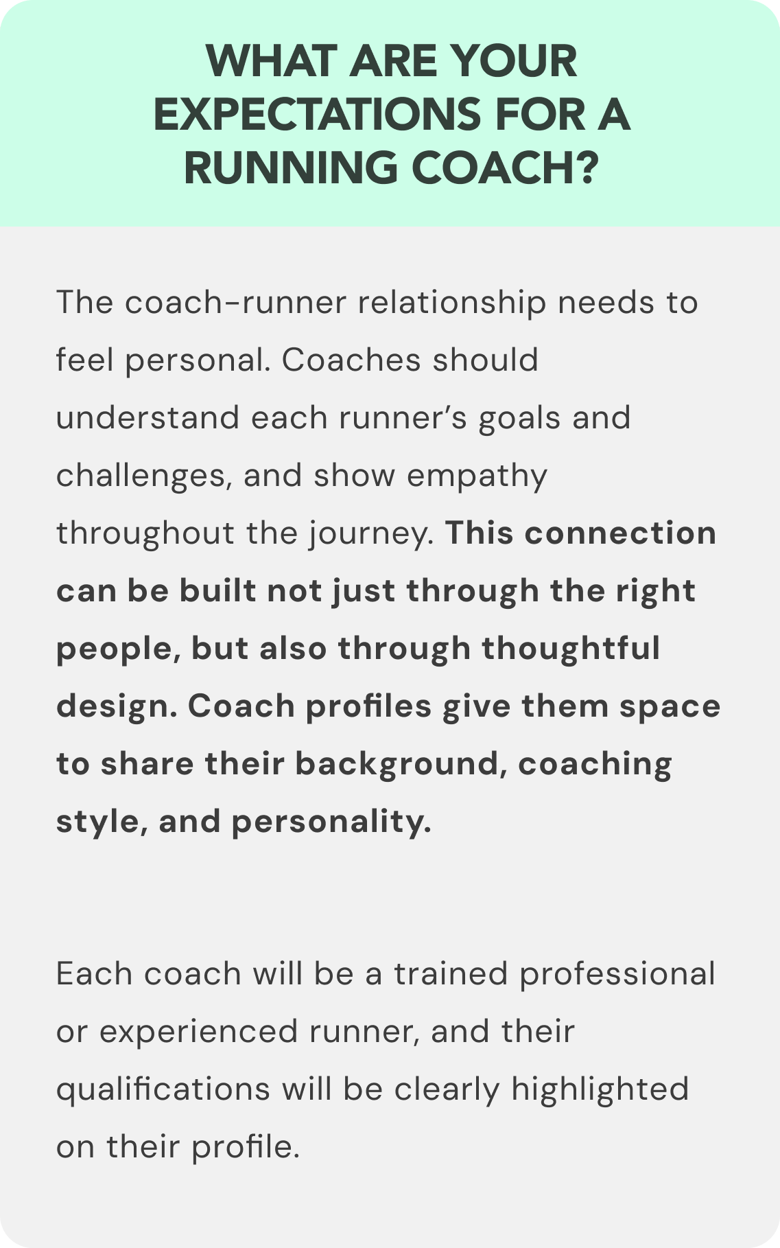
Provide a platform where the running experience is tailored for the user, offering them a professional coach and a motivational community experience. Generate confidence by offering runners personal plans from top coaches
STEP ONE
COMPETITIVE ANALYSIS
The first step was to analyse the competition to identify gaps and opportunities. I focused on Nike Run Club and Runkeeper (Asics), the results of the review confirmed my hypothesis: there was a definitive gap in the market for a personalized running coach.
STEP TWO
USER RESEARCH
To dive deeper into existing products and user habits, I interviewed a selection of runners – each with their own style, from new and casual runners, through to competitive. I asked open-ended questions to learn more about the following topics:
STEP THREE
USER PERSONAS
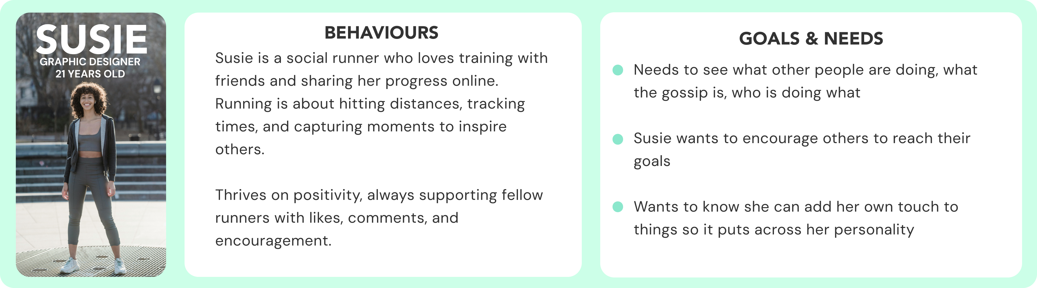
Now, I had better understanding of the space in the market and potential user needs. With this, I crafted 2 strong user personas that represent the sentiments passed over from the interviews along with the target audience for the app.
STEP FOUR
USER FLOWS
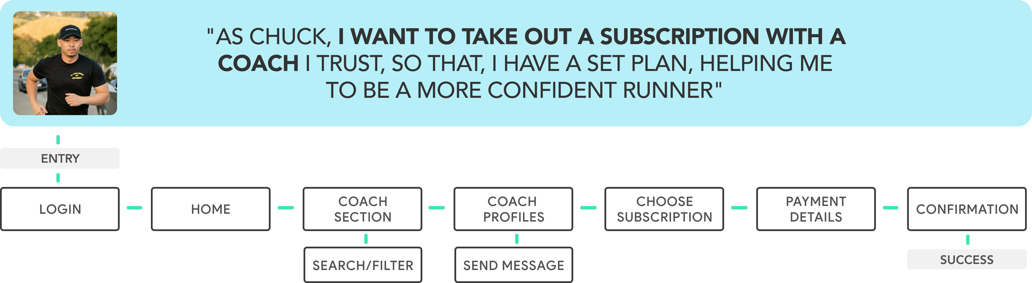
Before diving into design, I mapped out how users would interact with the app, their journeys, and key features.
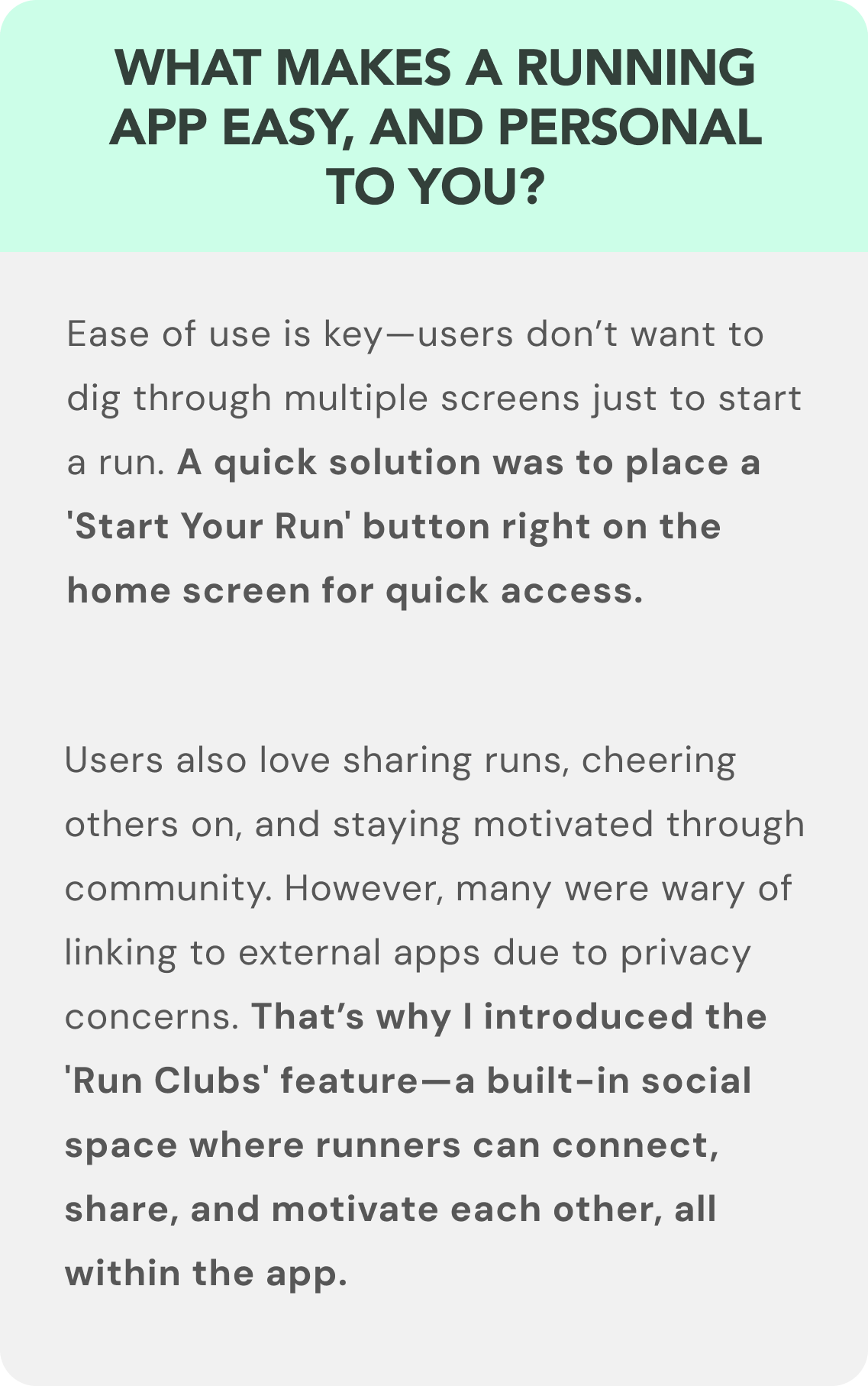
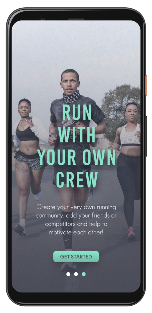
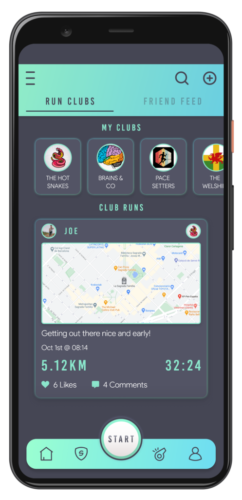
During interviews, many runners highlighted the social side of running apps—sharing runs, tracking others, and staying connected. That’s when I came up with the ‘Run Clubs’ feature. Instead of relying on external apps, users could create their own in-app communities to stay motivated together. This idea took shape through the task flow below:
STEP FIVE
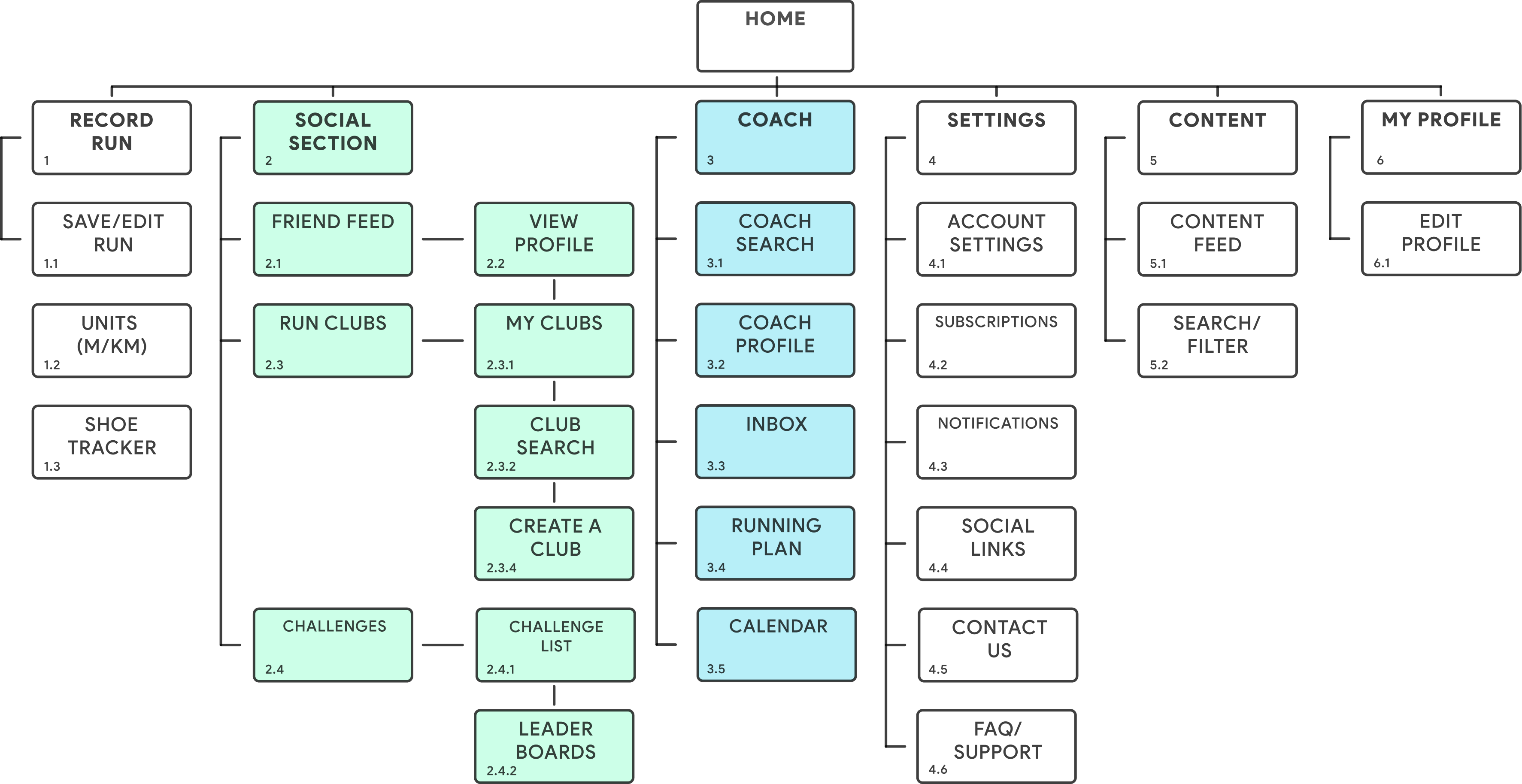
INFORMATION ARCHITECTURE
Getting to this point wasn’t easy. I ran an open card sort, which turned out to be more complex than expected. Each of the 10 participants had a unique way of organizing the content, leading to a wide range of categorization. What did I learn:
Clear labelling matters. If feature names aren’t intuitive, users will struggle. Some participants didn’t understand my original terms, which skewed results.
Don’t rely on surface-level data. At first, the results felt messy and unclear. But by digging into the full set of stats and patterns, the structure began to take shape.
STEP SIX
MID-FIDELITY WIREFRAMES
With the 2 user flows from earlier in mind, it time to start to understand how the design would look.
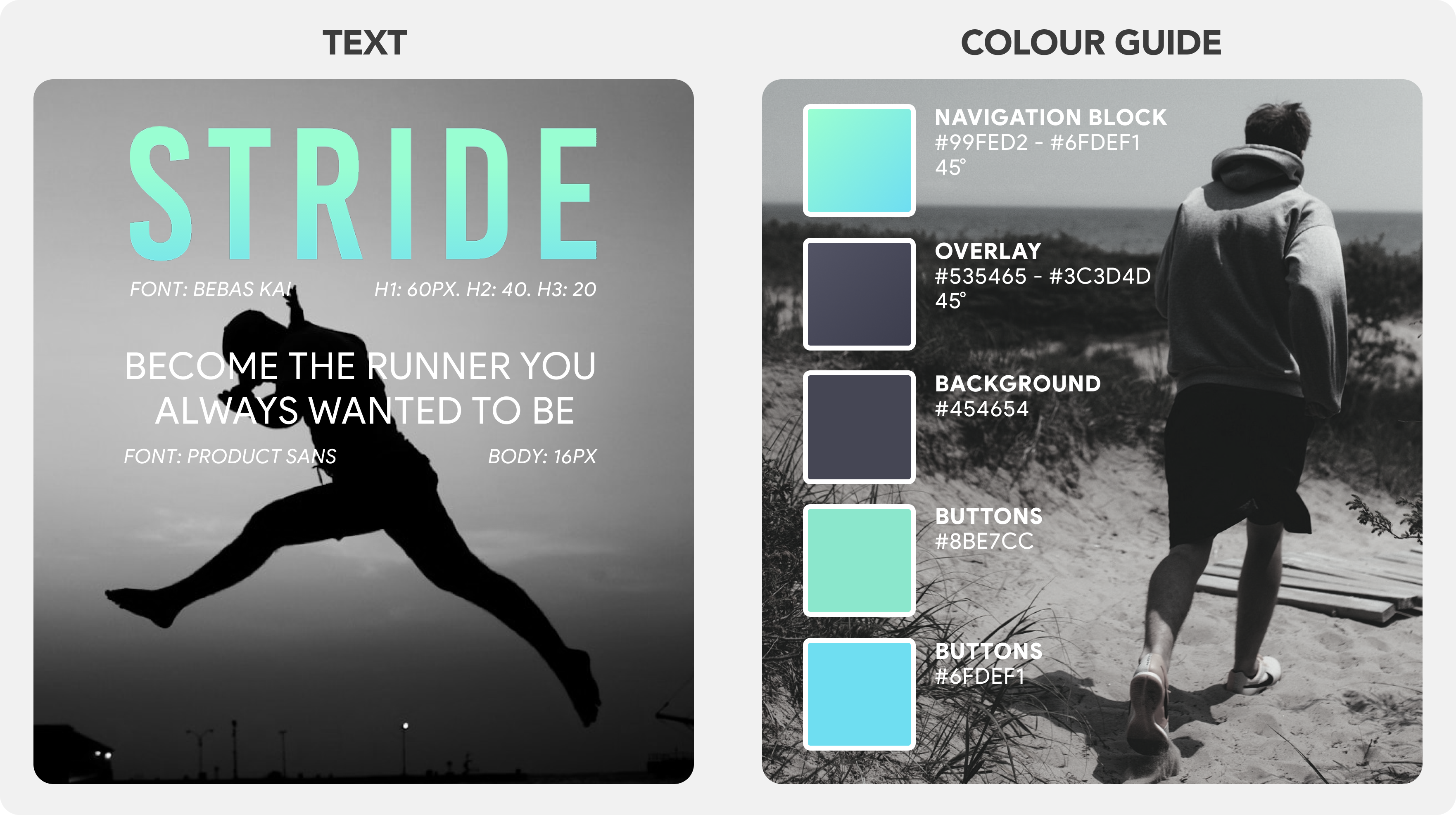
Using Adobe XD I crafted the designs below. I choose to use greyscale to allow for more focus on the navigation and tasks rather than the design at this point.
STEP SEVEN
USABILITY TESTING
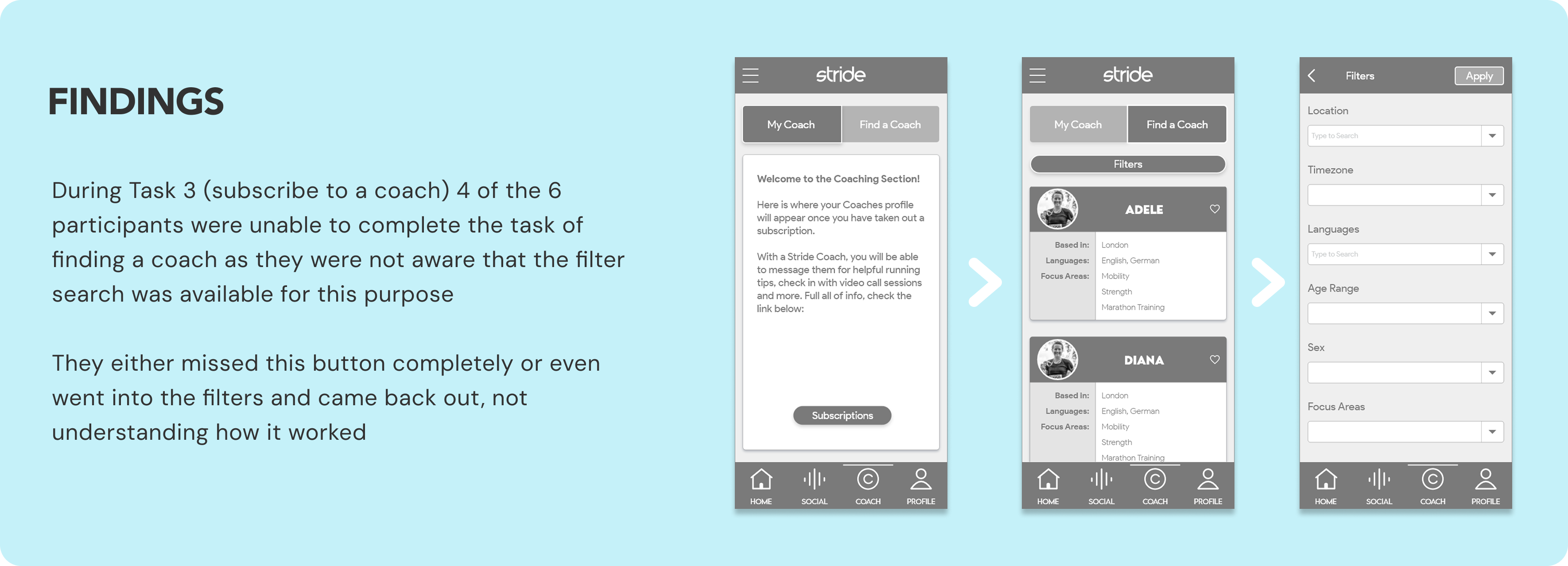
Using the mid-fidelity prototype I was now able to test the hypothesis regarding my design. I set up 6 user moderated interviews using a pre-planned script, where the interviewees would be asked to complete tasks based around the 2 main features
Task 1: Stride has a feature allowing users to create their own running club. You have opened the app today and you would like to create your own club. Can you please show me the steps that you would take to do so.
Task 2: You are logged into the app as Hannah. Today you want to check on the price of a subscription as you are interested in getting a coach. Please show me how you would do so.
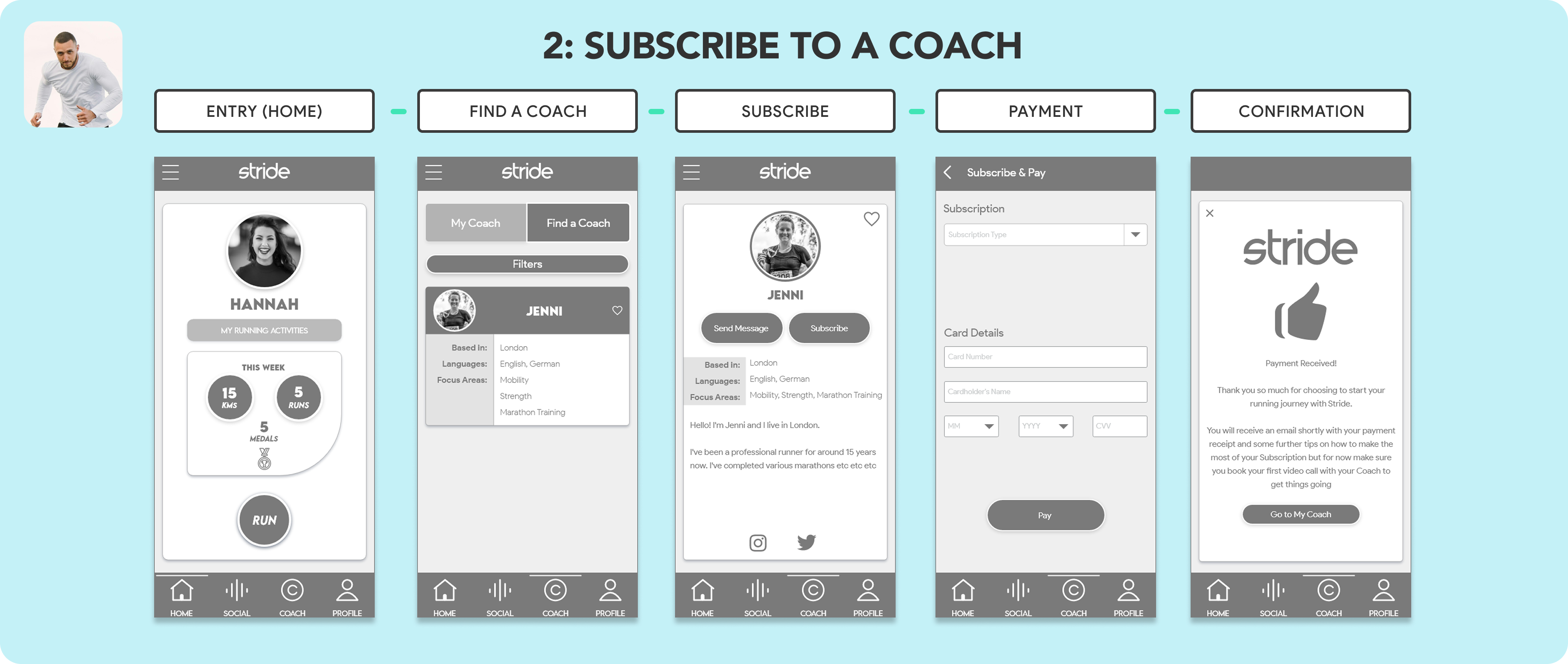
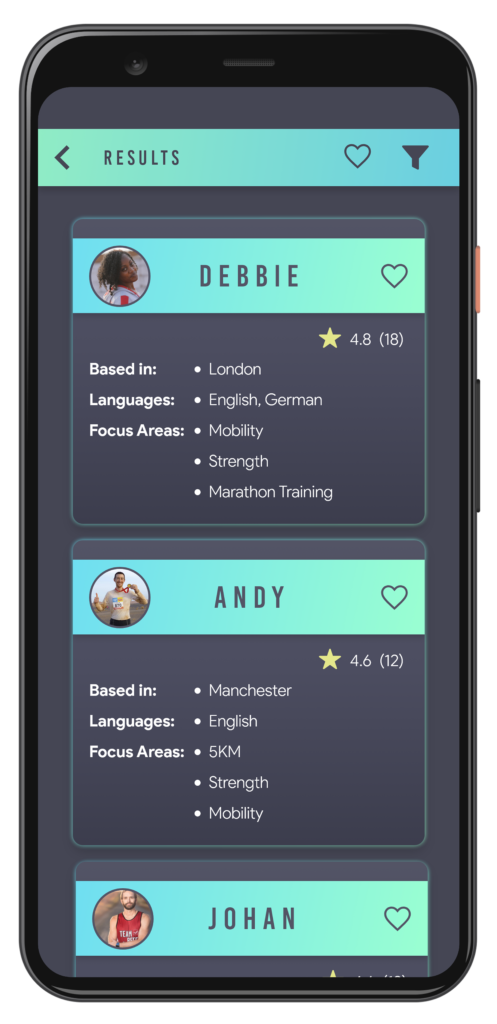
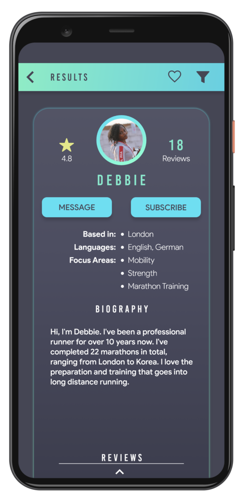
Task 3: After checking the subscription costs you now want to search for a running Coach. Youare looking to Subscribe to Jenni. Can you please show me how you would achieve this and talk me through the steps you would take.
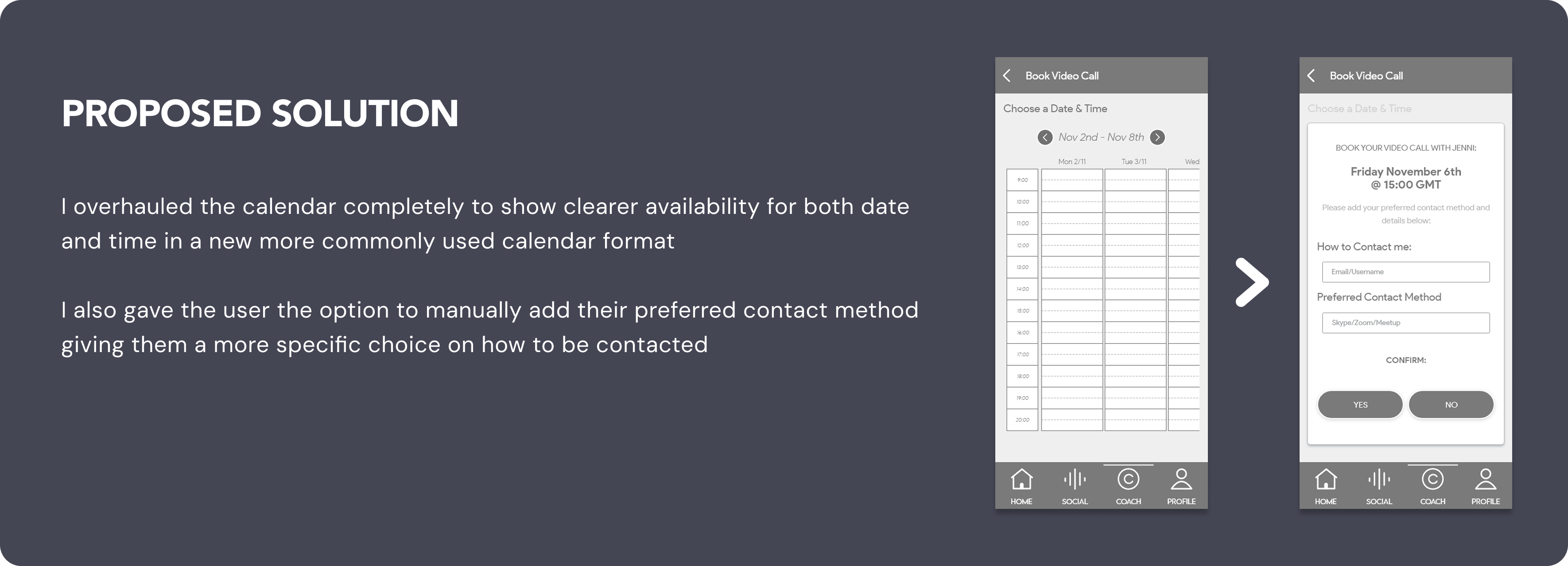
Task 4: Now you have a coaching subscription with Jenni, could you please show me the steps you would take to book a video call with Jenni.
STEP EIGHT
THE DESIGN
FINAL SCREENS
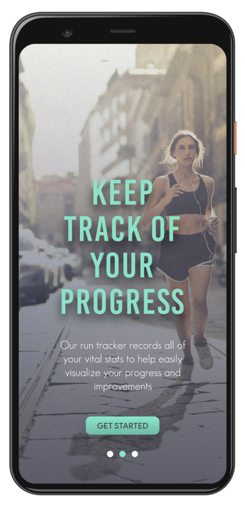
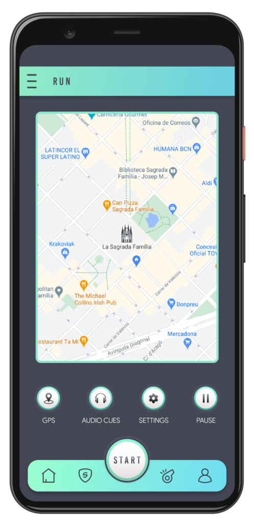
Here you can see a few screens from the final design showing the Onboarding, Home, Coaching and Run Club sections.
ONBOARDING
ONBOARDING
ONBOARDING
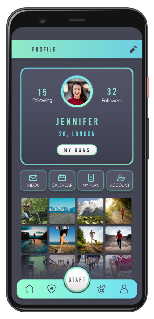
home
run
profile
ONBOARDING
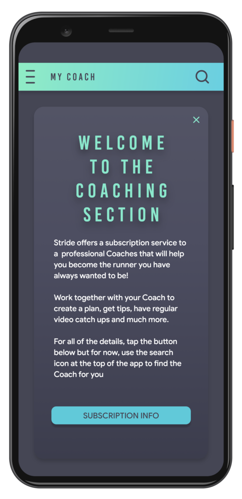
coaching
ONBOARDING
ONBOARDING
run clubs
ONBOARDING
LEARNINGS
Test it, then Test it again
I made a lot of early assumptions and hypothesise that were immediately discredited during testing. This taught me that whenever an idea occurs, test it…
Don't Fall In Love
When you are working on a design for so long it can be so easy to get attached to it. I learnt that you can get personal about it, but fall in love with its purpose and how it will be used instead
Iteration Is Key
Rome wasn’t built in a day, and as such, your product won’t be either. Lay one brick at a time, build slowly and make iterations to ensure that the foundation is always there
Don't Fall Into The Rabbit Hole
It became easy to get lost at times and become unproductive. I learnt that collaboration, sharing your work and getting feedback are key at times. 2 heads are better than 1. It can give you that little spark you need to push forward